Identity, Visual Language
Doctor Declutter
Applied Arts Awards 2014 Best Complete Design Program
no2clutter.com


As a new player in an already crowded home services marketplace, Doctor Declutter needed a brand that would stand out, as well as appeal to an older demographic helping them feel comfortable inviting this service provider into their home.
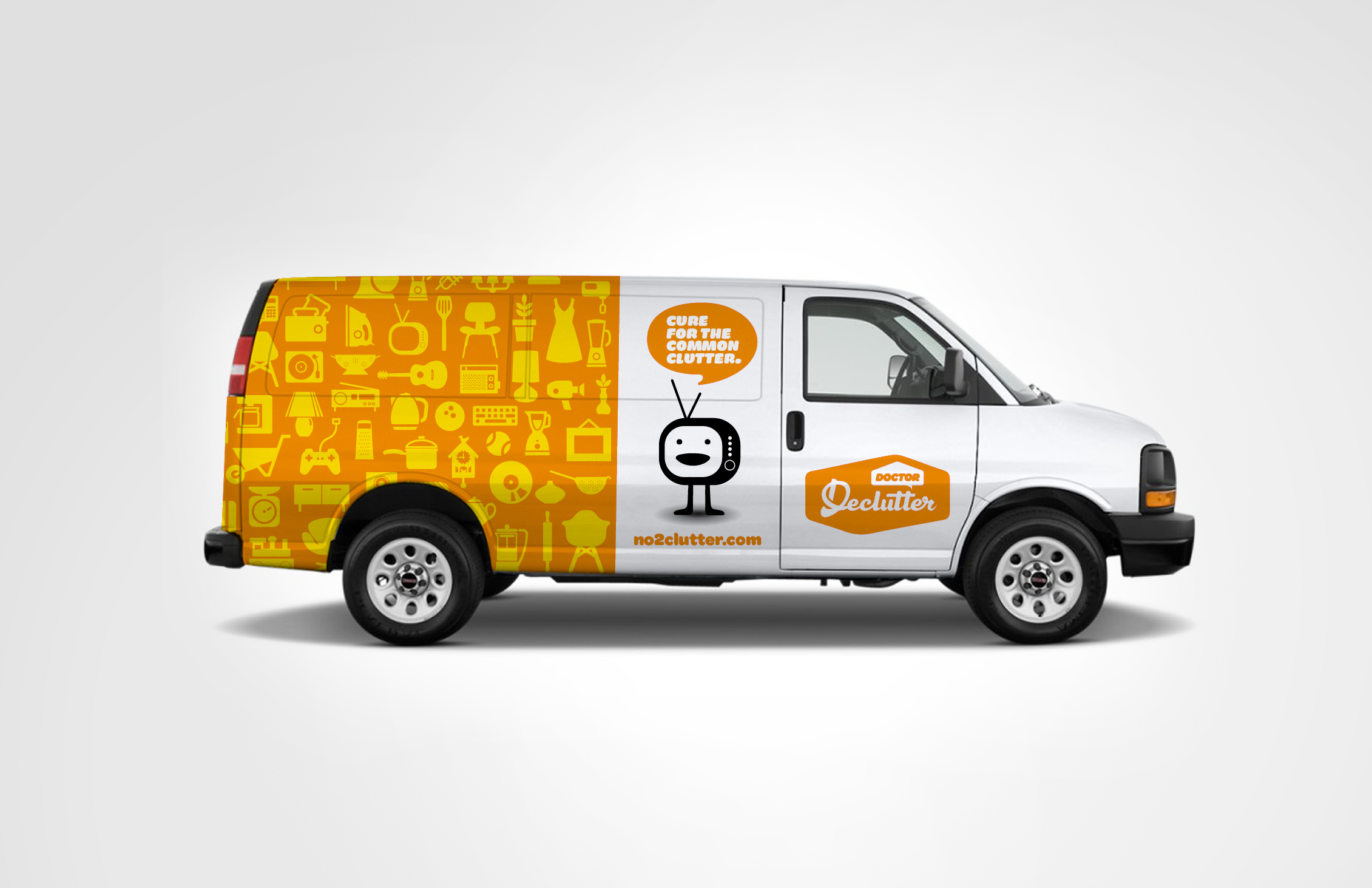
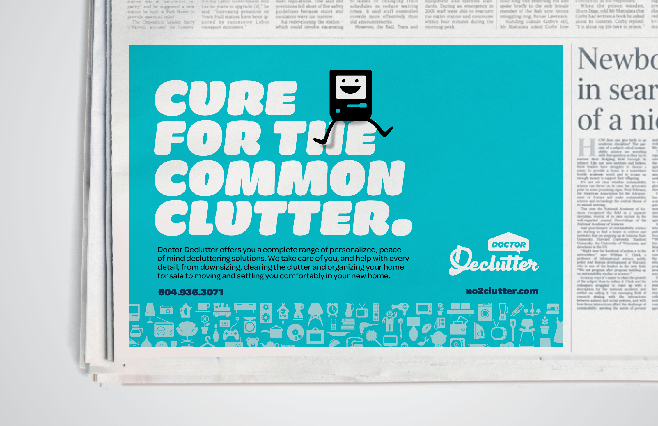
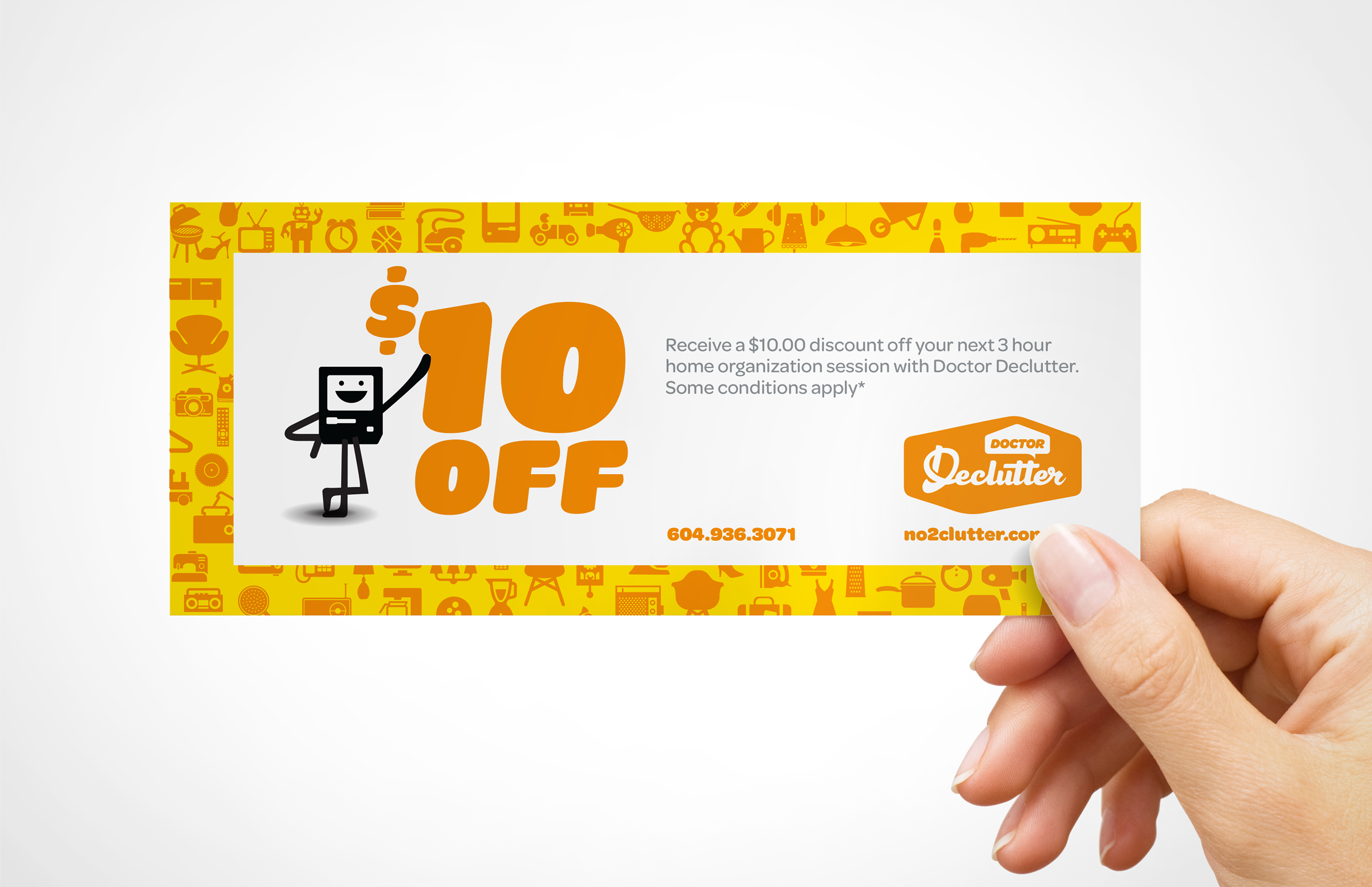
The new logo is approachable, and distinctive.The handcrafted wordmark feels contemporary, friendly
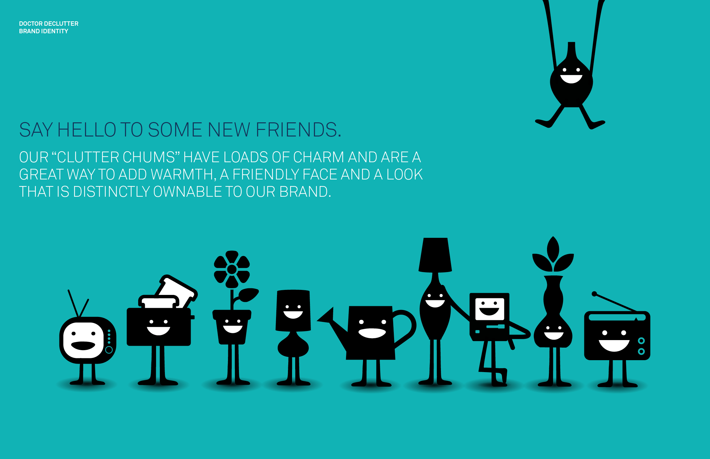
and conversational with the use of rounded corners and playful shapes while the house enclosure speaks to what they do. The logo housing takes inspiration from the equity and trust of vintage crests. A pattern of iconic household items was created to communicate the idea of clutter and organization, as well as the introduction of the “clutter peeps” that have loads of charm and add a friendly face to the brand.
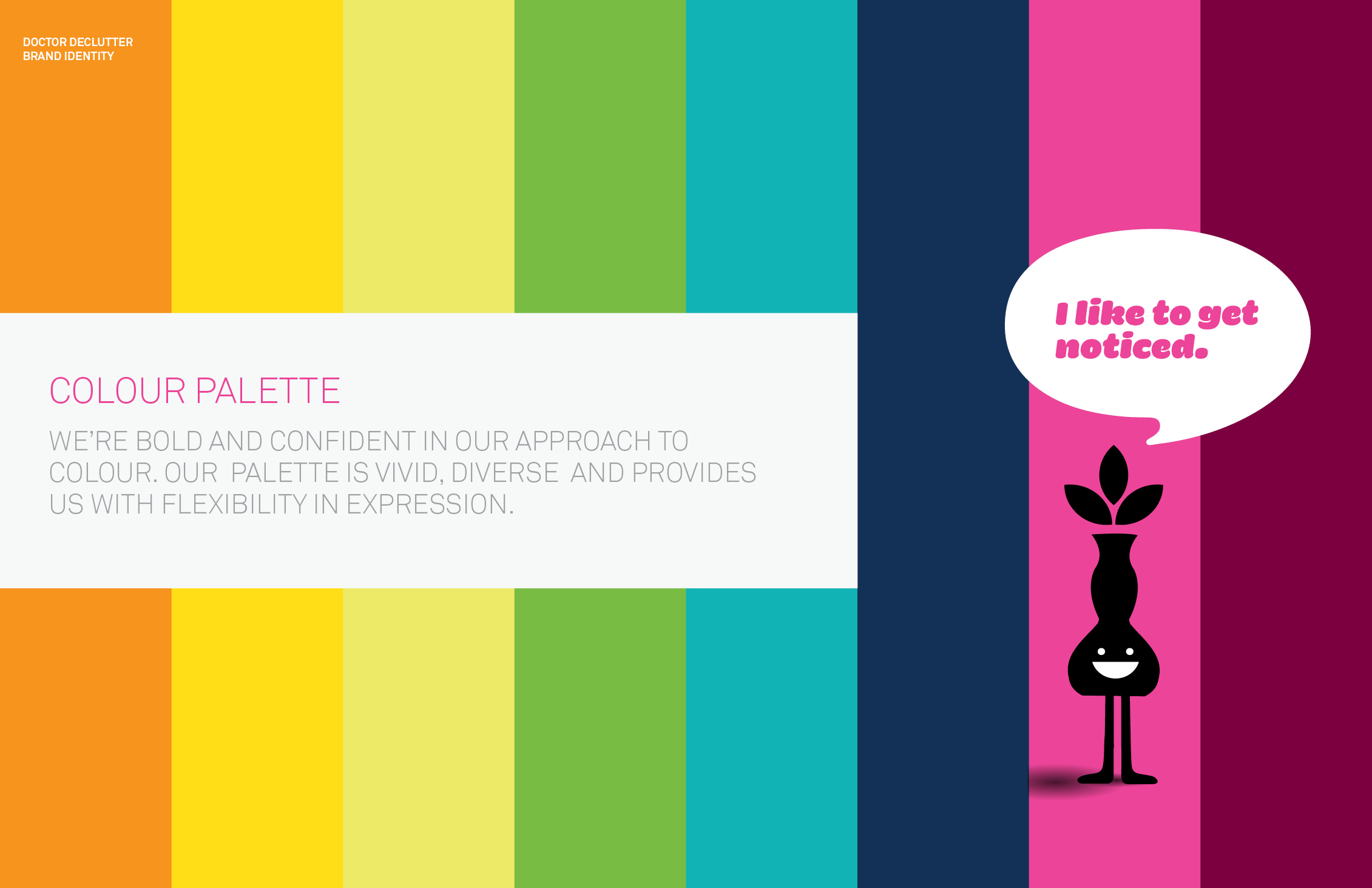
An approachable, friendly typeface to compliment the logo, and a bold, confident approach to colour with a vivid, diverse palette, provides flexibility in expression and a look that is distinctive and ownable.
Agency: Cossette
Creative Director: Nick Richards
As a new player in an already crowded home services marketplace, Doctor Declutter needed a brand that would stand out, as well as appeal to an older demographic helping them feel comfortable inviting this service provider into their home.
The new logo is approachable, and distinctive.The handcrafted wordmark feels contemporary, friendly
and conversational with the use of rounded corners and playful shapes while the house enclosure speaks to what they do. The logo housing takes inspiration from the equity and trust of vintage crests. A pattern of iconic household items was created to communicate the idea of clutter and organization, as well as the introduction of the “clutter peeps” that have loads of charm and add a friendly face to the brand.
An approachable, friendly typeface to compliment the logo, and a bold, confident approach to colour with a vivid, diverse palette, provides flexibility in expression and a look that is distinctive and ownable.