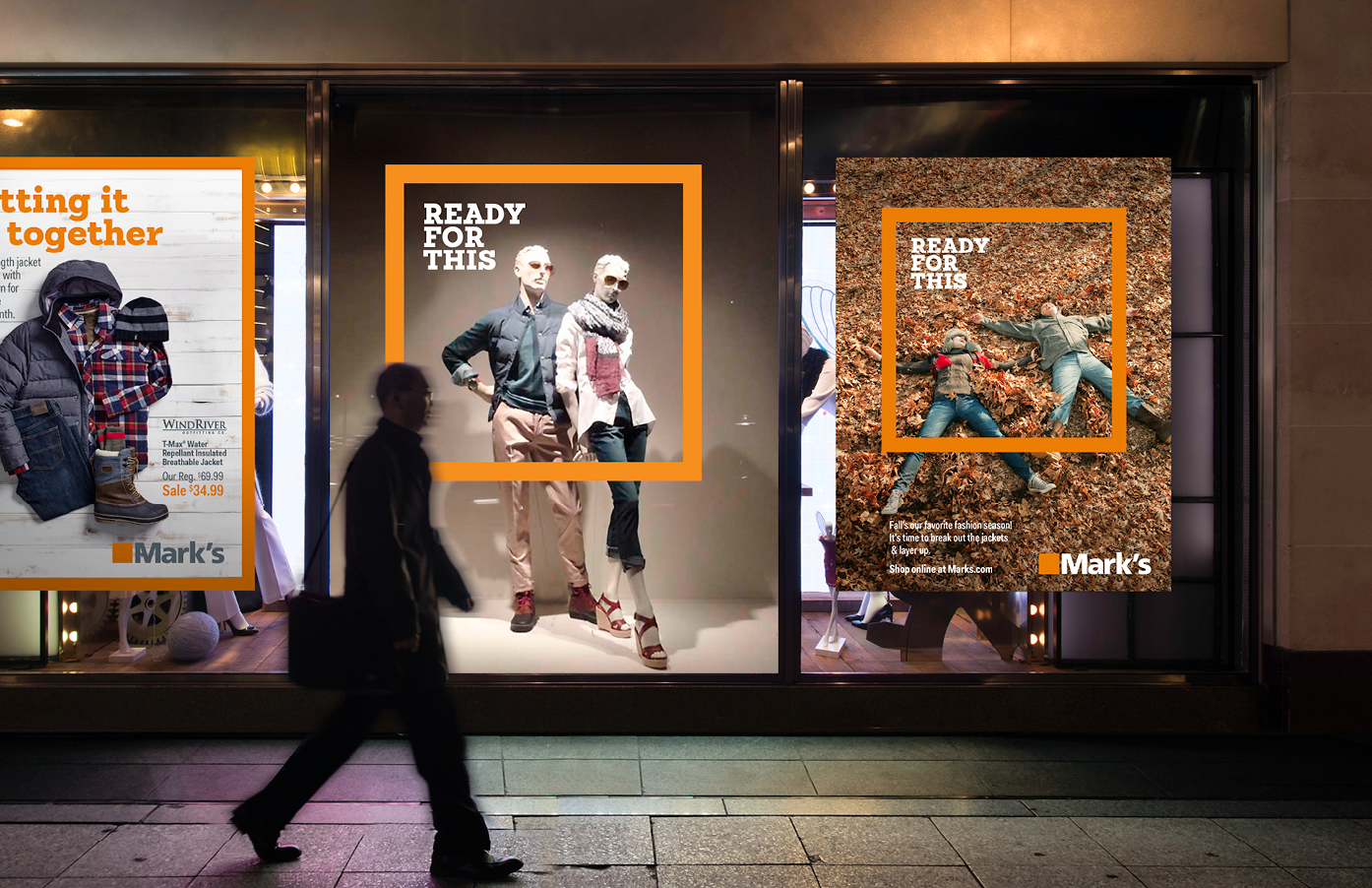
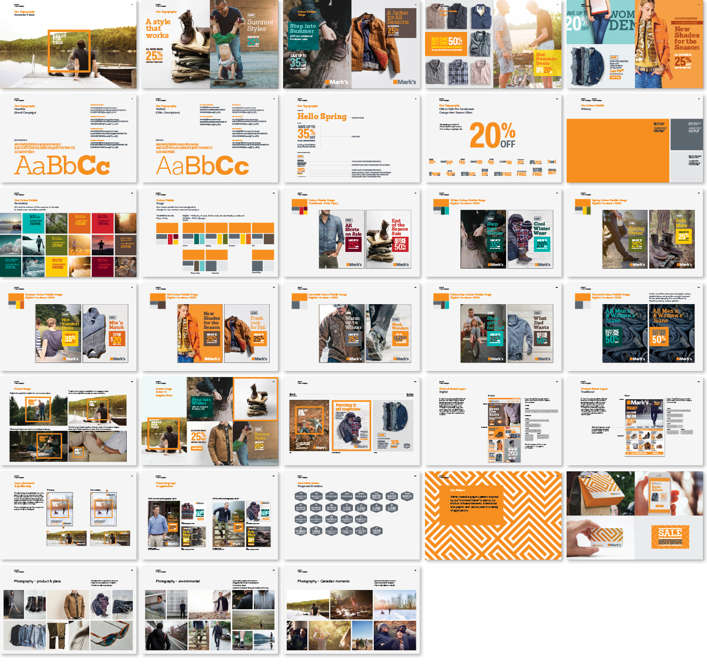
Marks is an affordable Canadian clothing retailer that got their start in work wear. With an aging customer base they were looking for a brand refresh to help them appeal to a younger demographic without alienating there current clientele. A more contemporary typeface and photography style, a bold new pattern, and a colour palette not only inspired by but which also changed with the seasons, were just part of the new visual language developed to help breathe new life into a dated looking iconic Canadian brand.