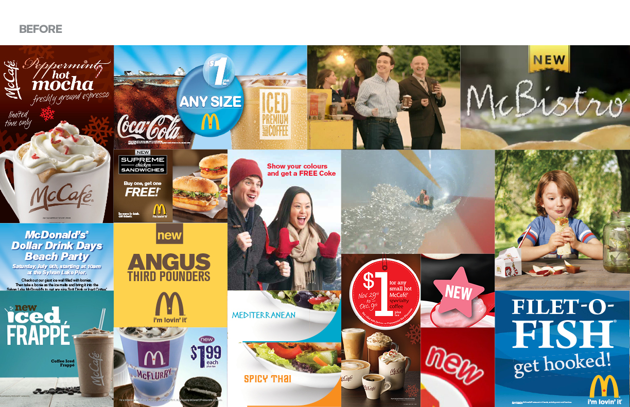
McDonald’s and its Golden Arches are one of the most iconic brands in the world. A visual audit of the McDonald’s Canada brand concluded that there was little continuity or consistency and a need for simplicity, clarity and to develop a look that is recognizably McDonald’s.
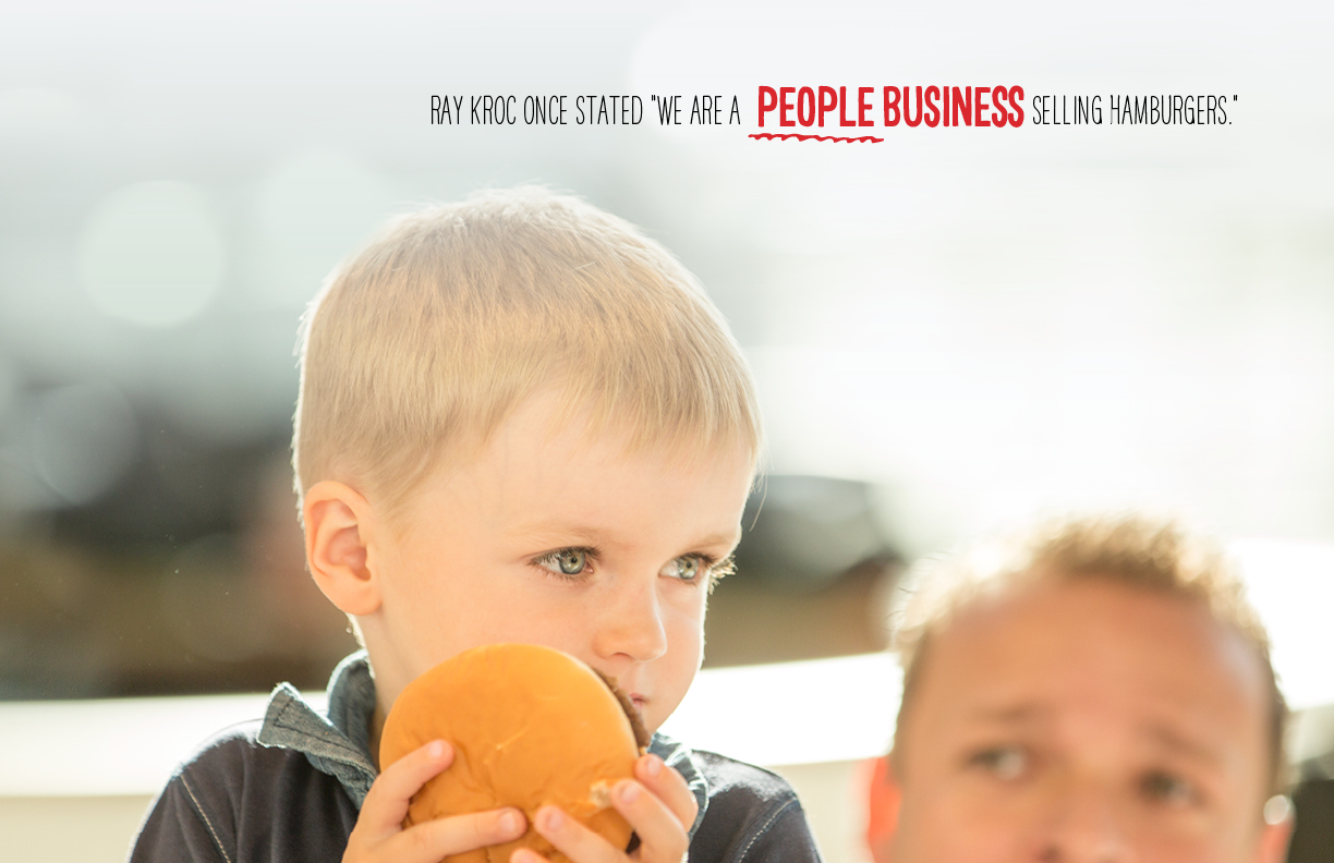
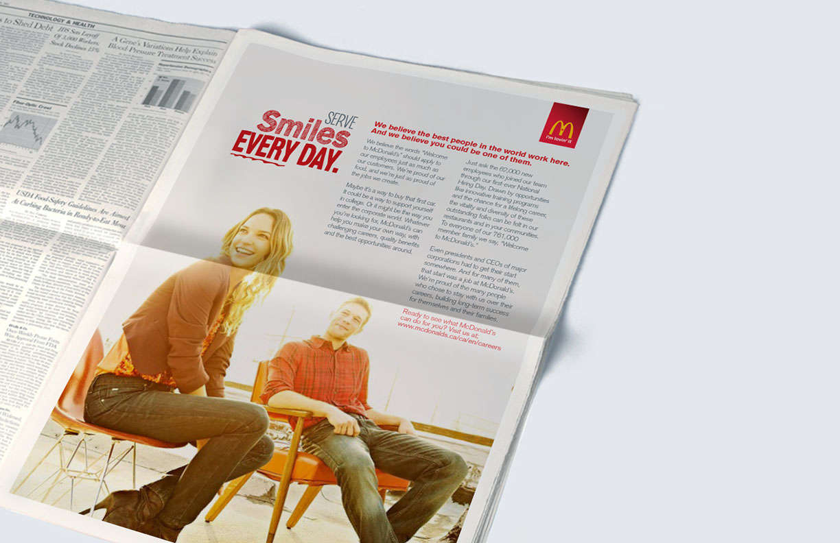
Pulling from multiple, inconsistent strategic documents that already existed, the Brand Promise of “Simple, Easy Enjoyment” was defined. The new brand essence of “Genuinely Good” informed the tone of the rebrand in that to create an emotional connection with our customers that was genuine, we needed a brand look and feel that was more welcoming, honest and real.
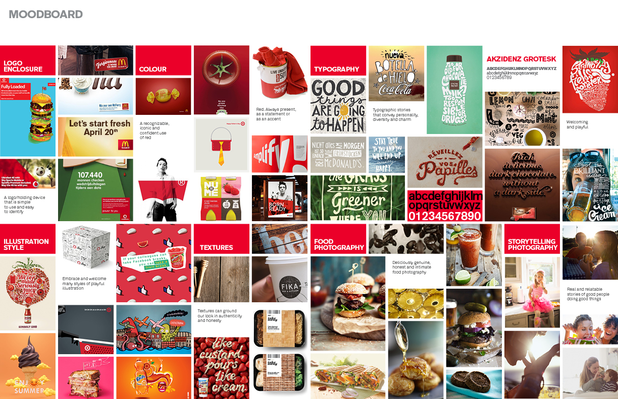
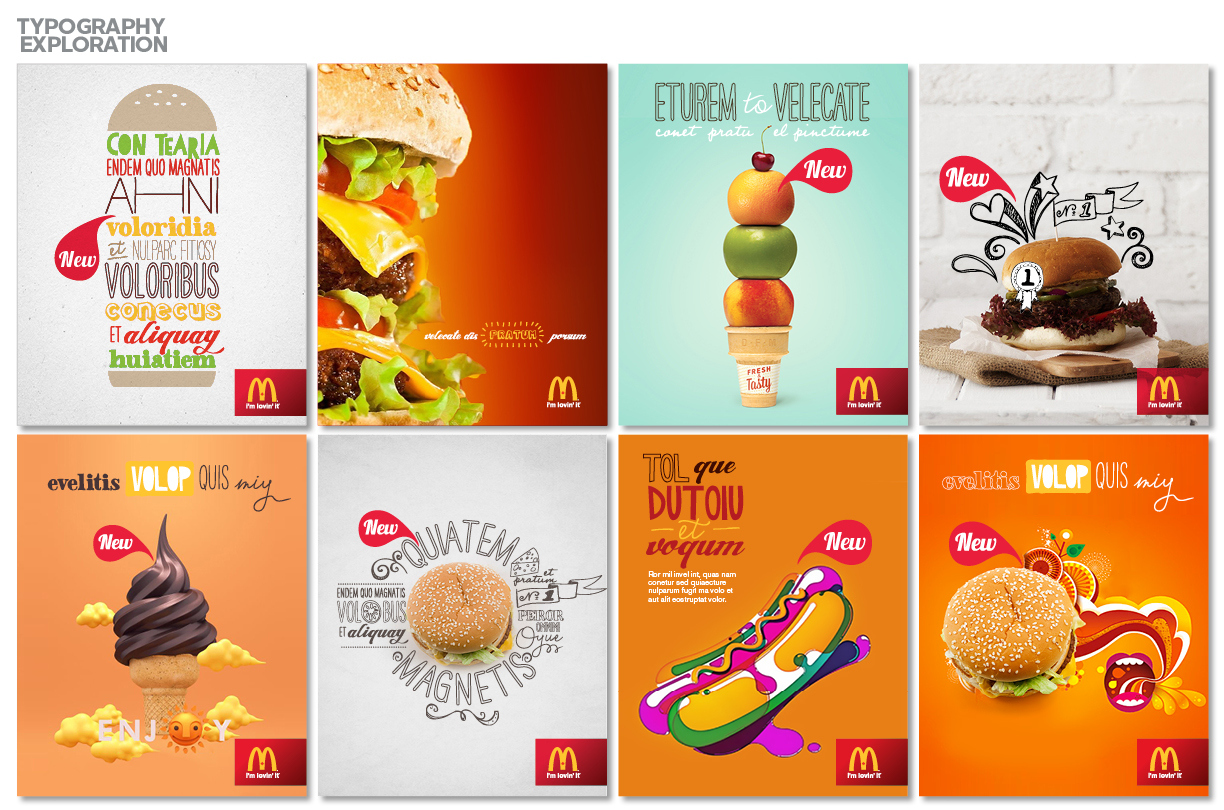
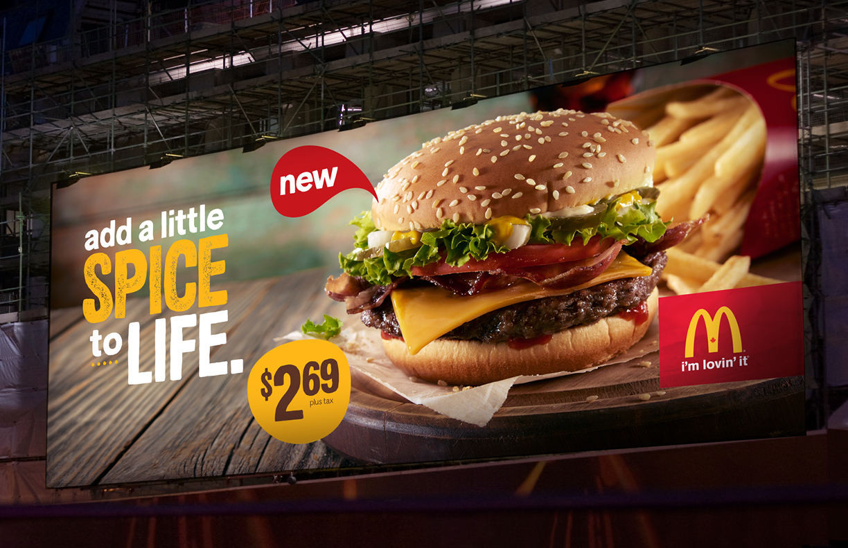
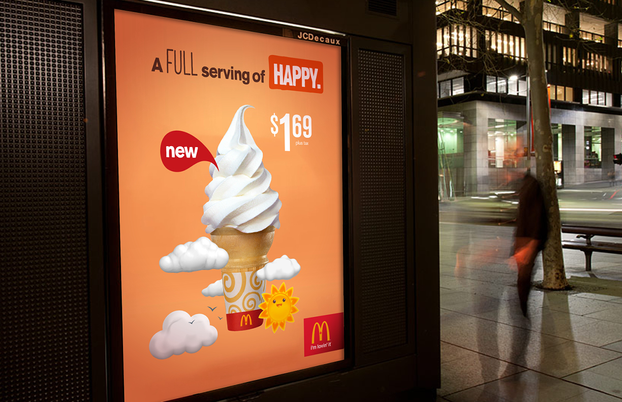
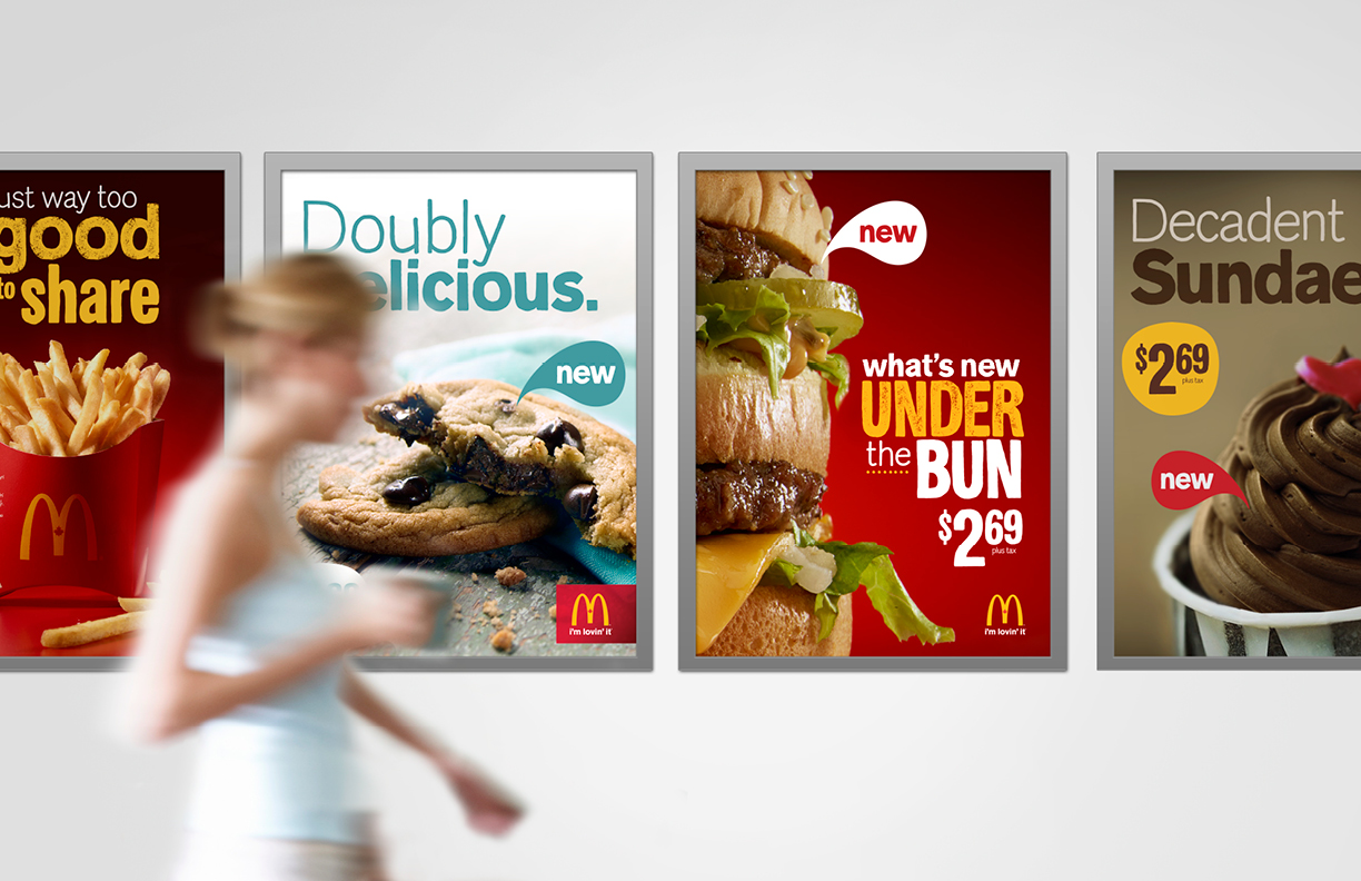
A hand drawn proprietary typeface in a variety of styles was developed to help inject more personality and charm into our headlines.
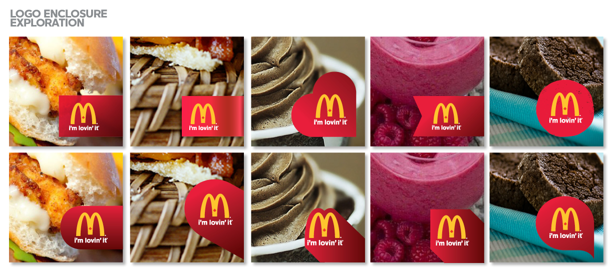
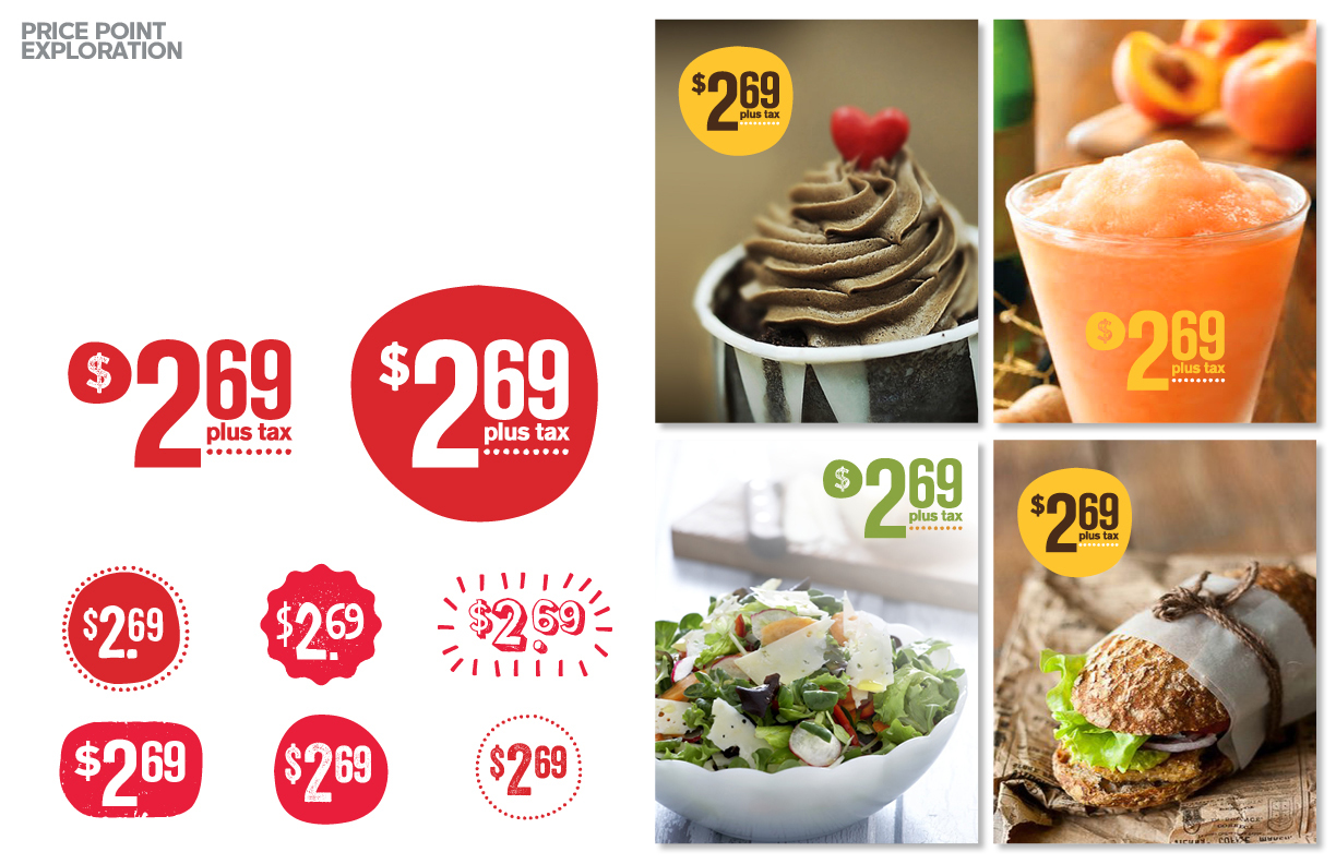
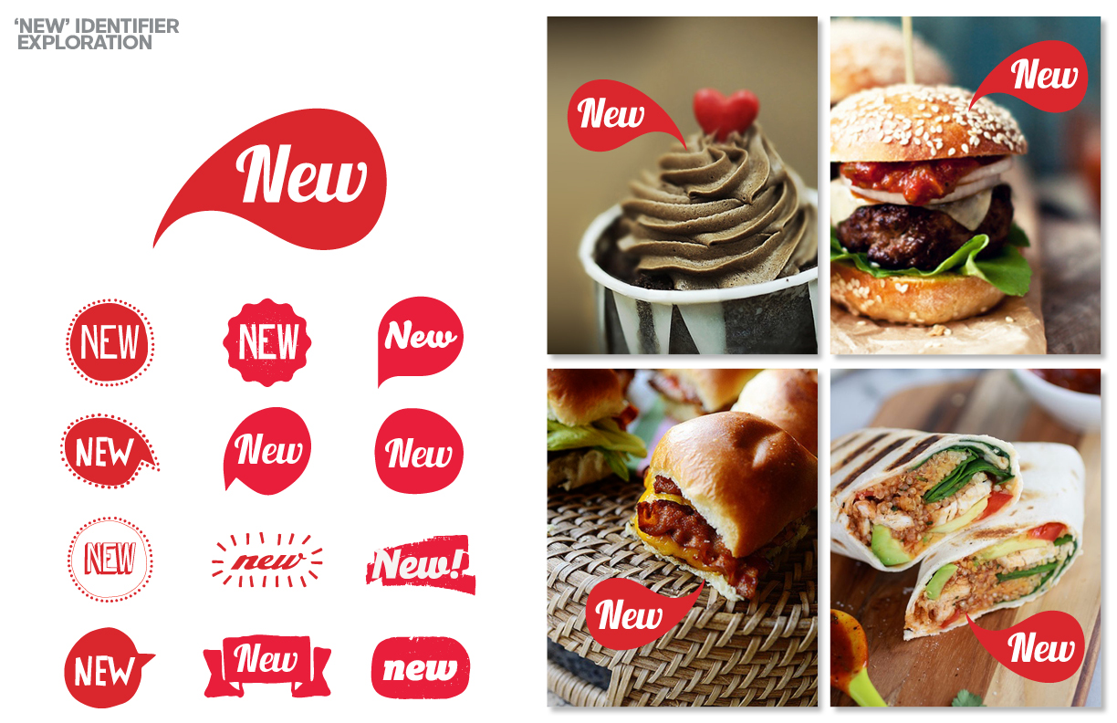
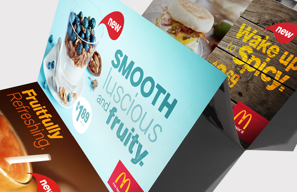
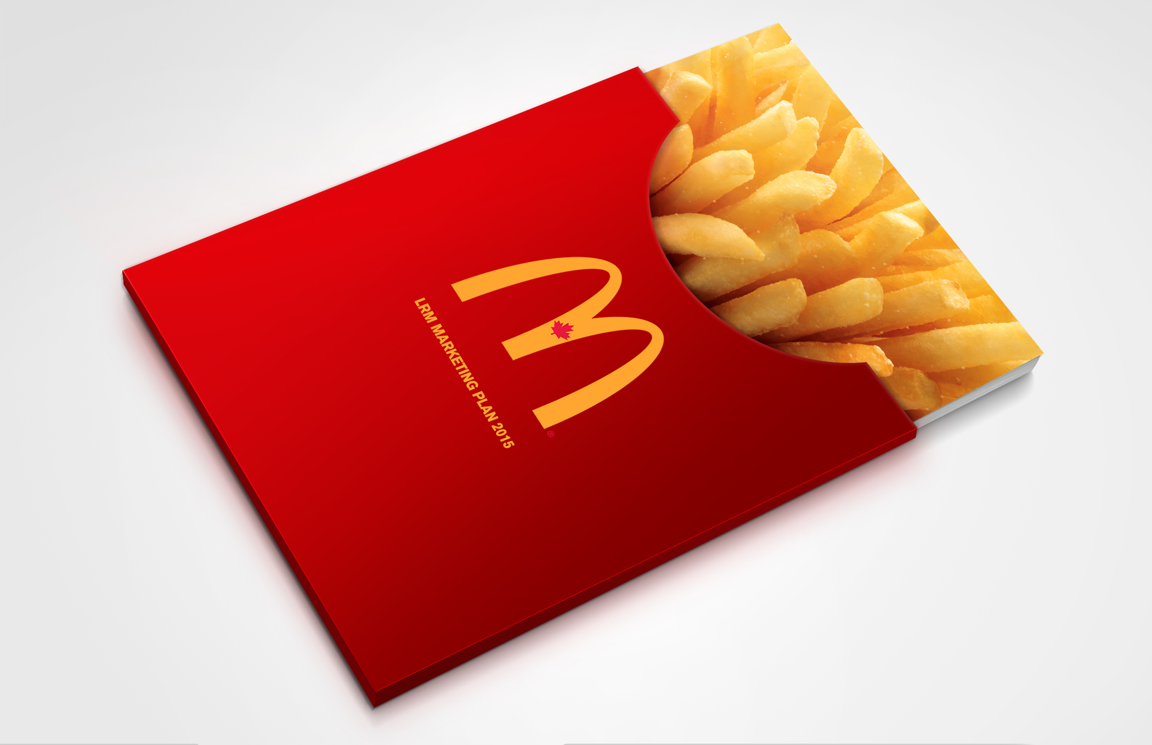
A revitalized colour palette as well as a new attitude to how we use colour was defined. To build consistency and continuity some of the most commonly used graphic elements, ‘new’ identifiers and price points were standardized with a look to complement our hand drawn typography. A more real and authentic food photography style was developed showing the food as imperfect and casual, surrounded with textures, ingredients, crumbs, dripping cheese and overflowing sauce - all helping to make it feel genuine, honest, intimate and mouthwateringly delicious. A new enclosure for the Golden Arches logo provided a simple, and flexible holding device and a consistent element of McDonald’s red in all communications.
Extensive brand guidelines were developed to showcase the new brand and align all internal staff and creative agency partners.