Identity, Visual Language
Seva
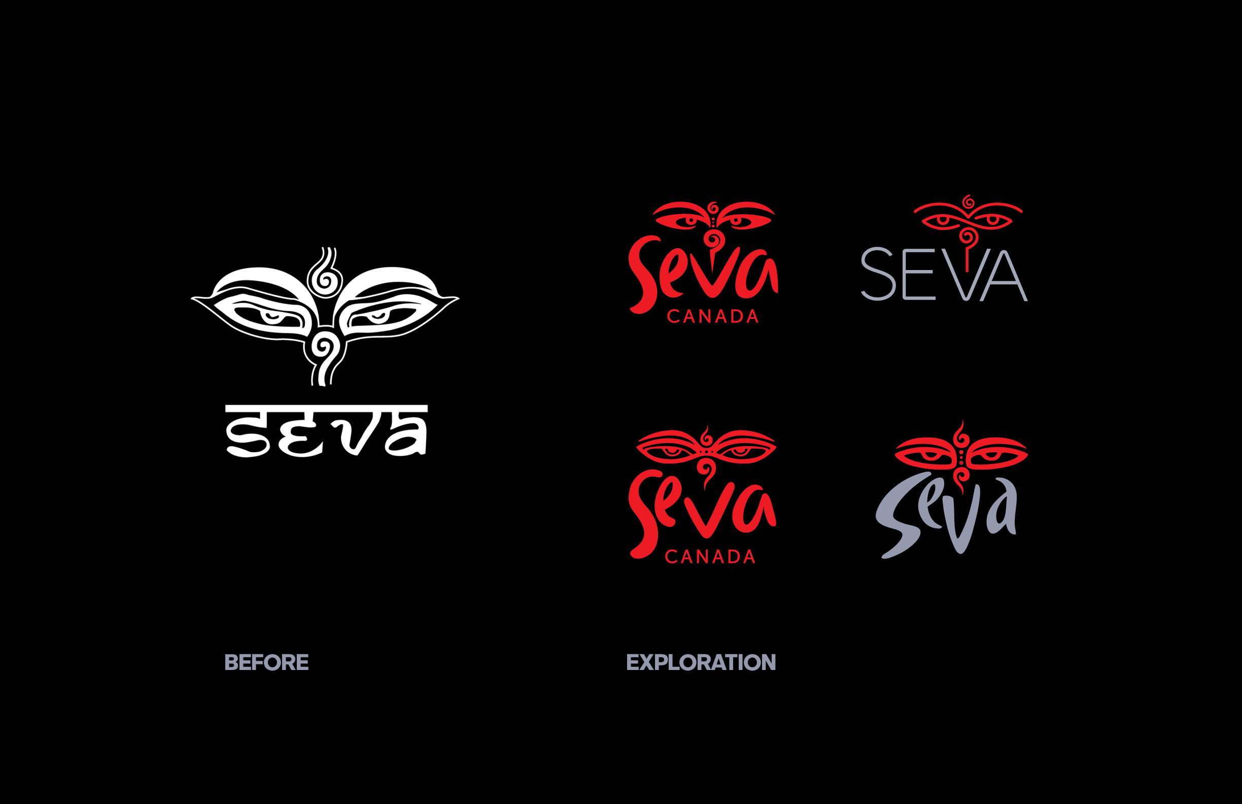

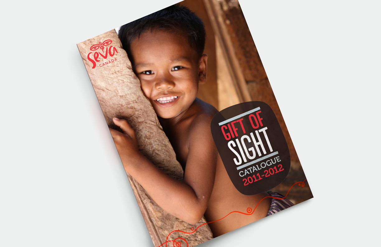

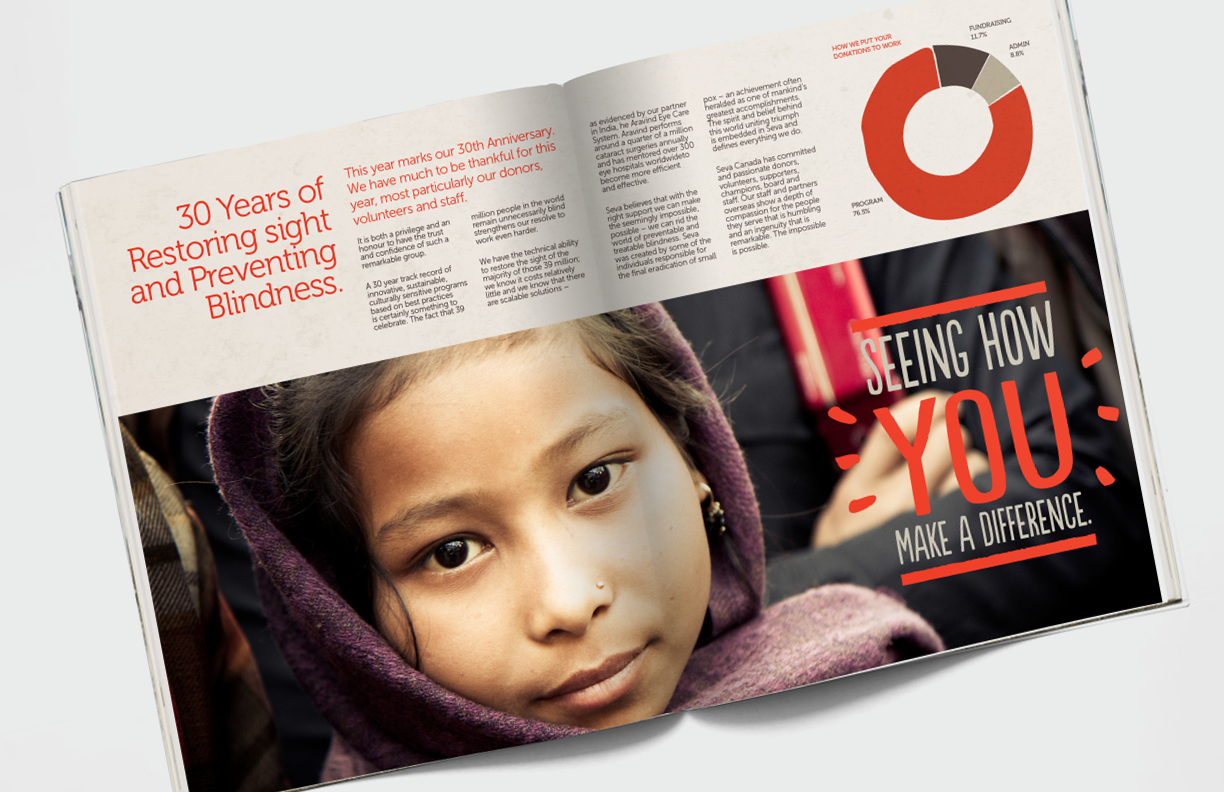
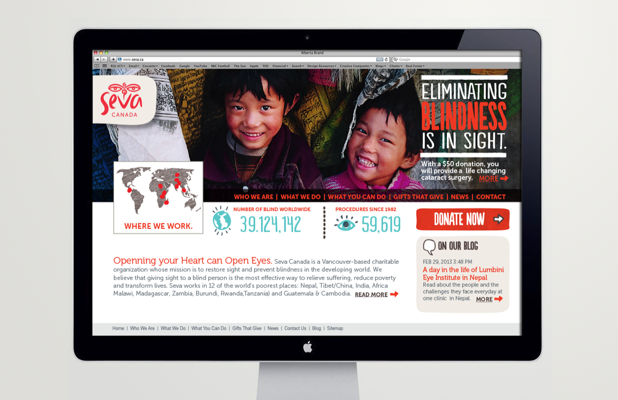
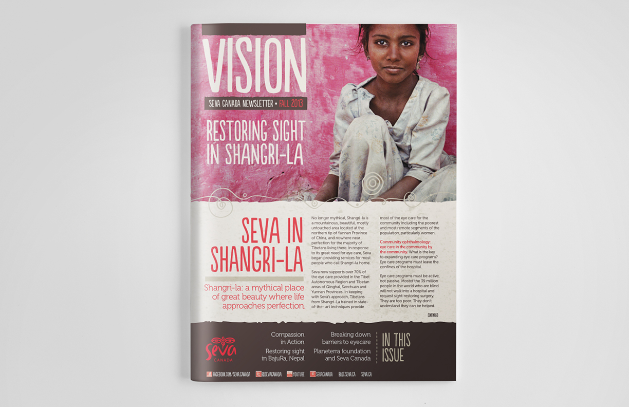
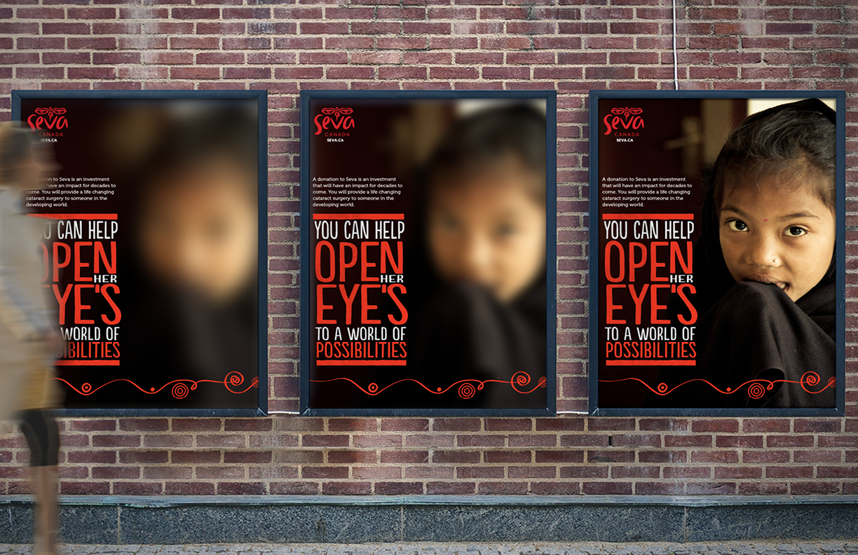
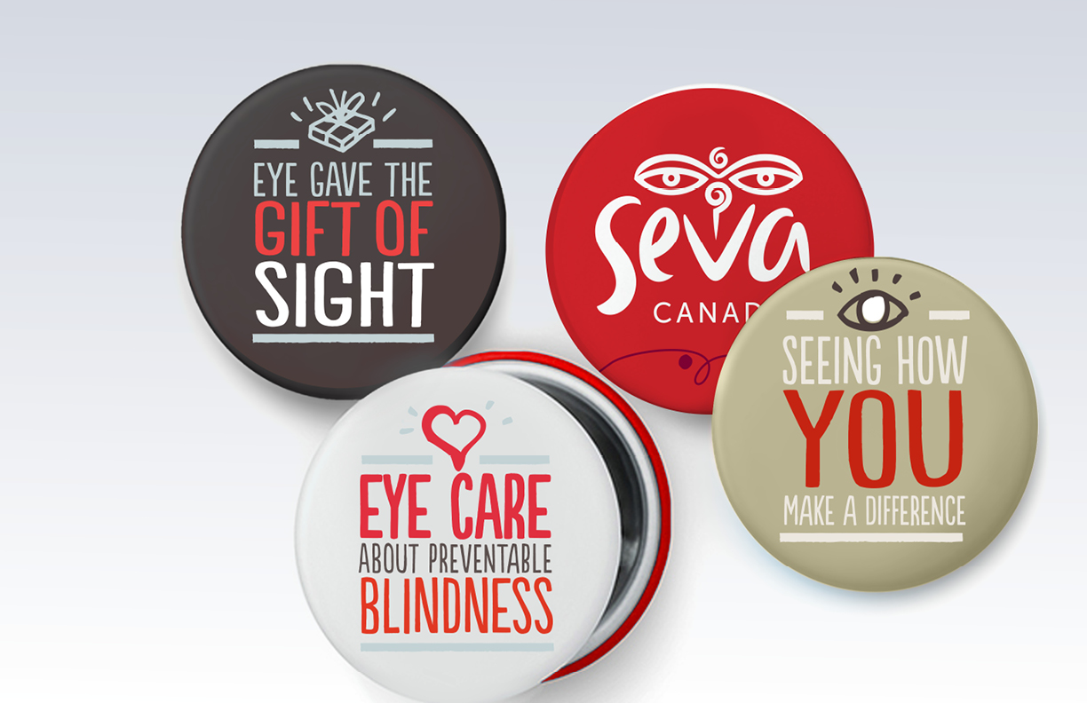
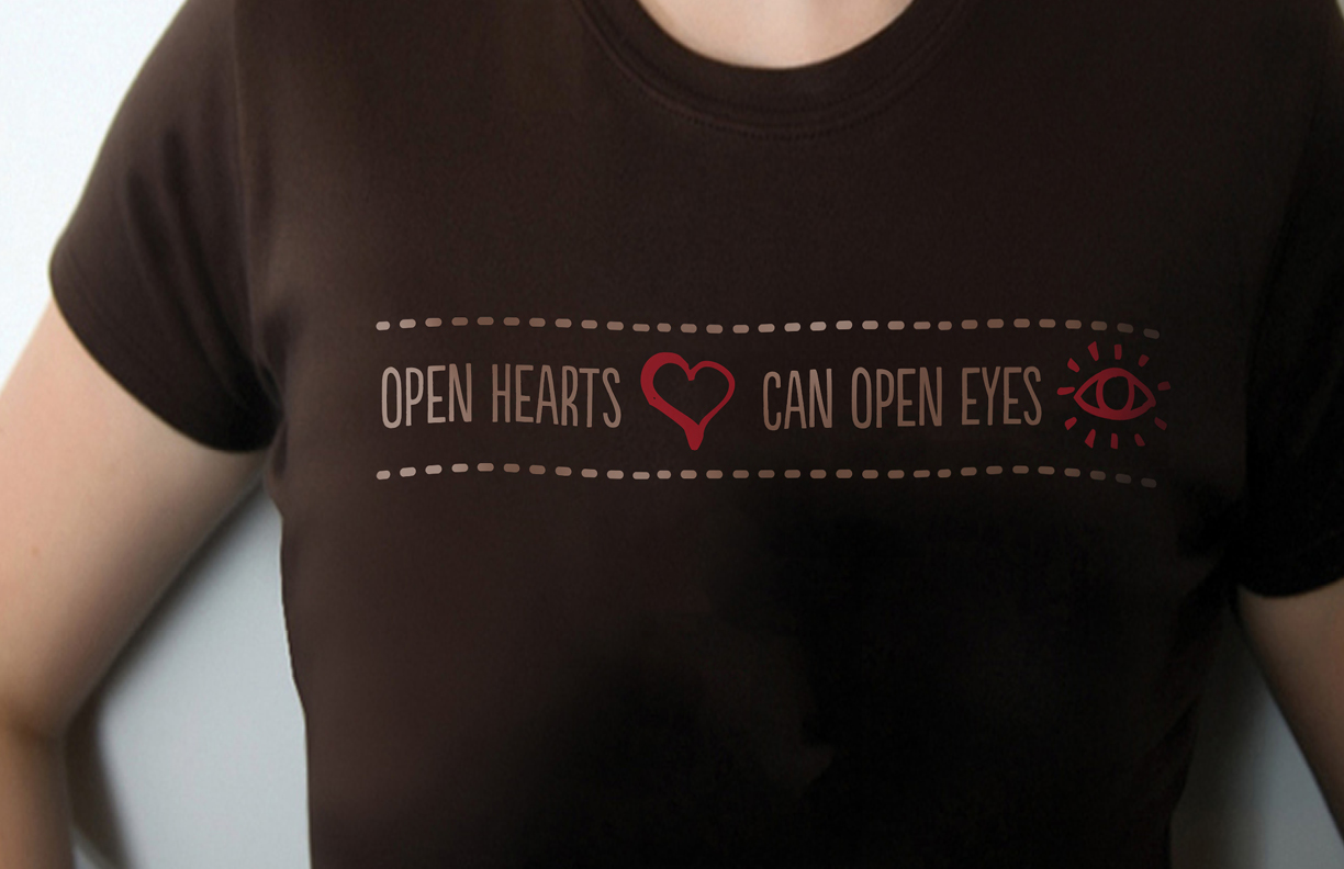
Seva Canada is an international eye care charity based in Vancouver. Its mission is to restore eyesight and prevent blindness in the developing world.
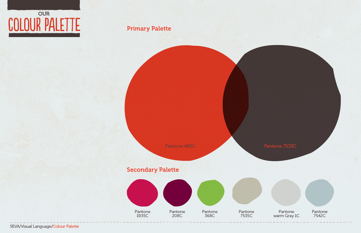
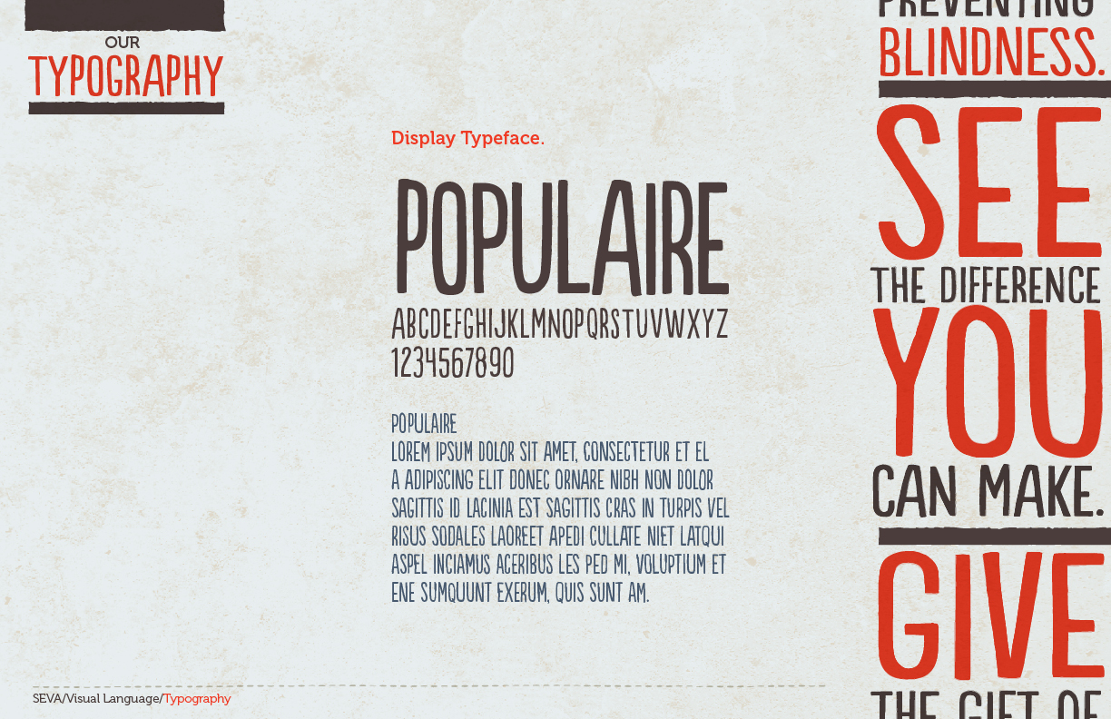
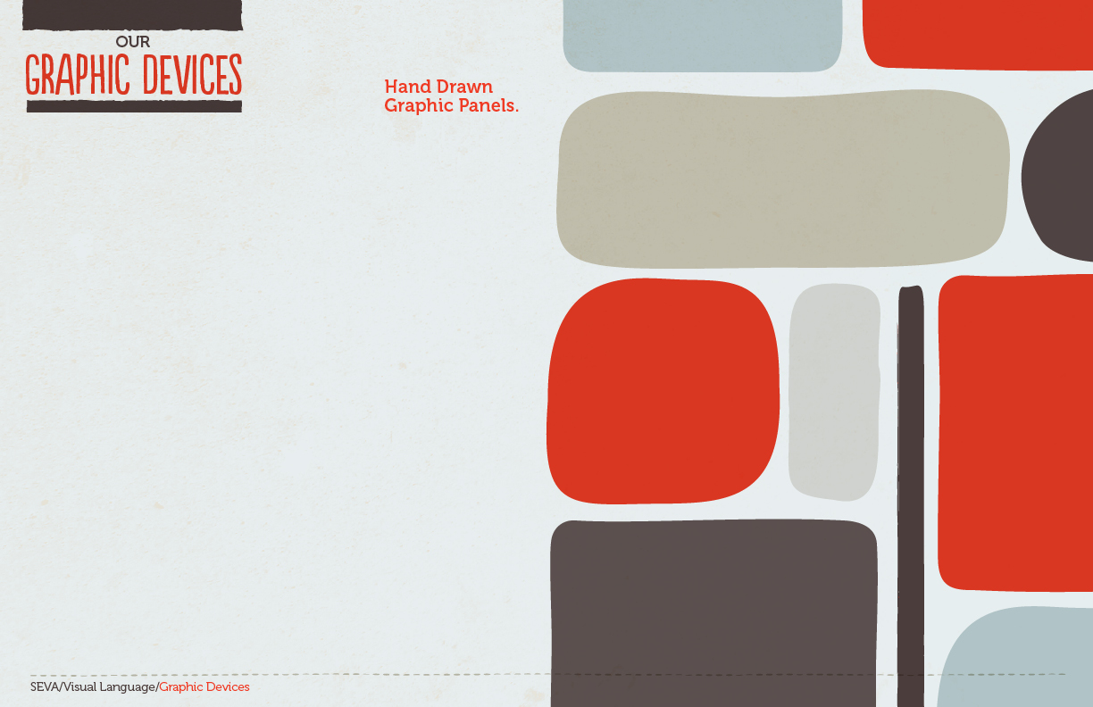
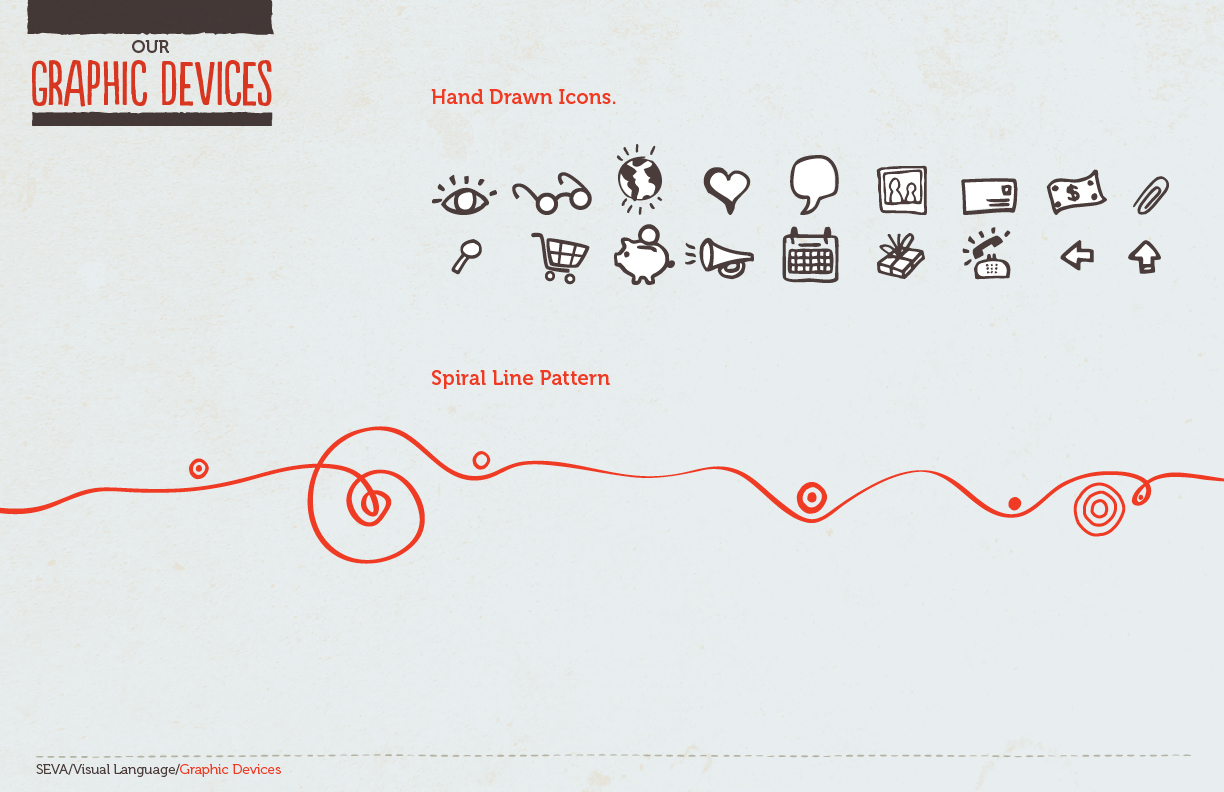
Due to equity already established both internally and externally in their existing mark, a simple refresh of their logo was required. To help their brand resonate among potential donors, a visual language with a more human, personal approach was developed with hand drawn typeface and icons, organic graphic shapes and a colour palette and graphic patterns inspired by the cultures of the countries where they serve.
Agency: Cossette
Creative Director: Nick Richards
Seva Canada is an international eye care charity based in Vancouver. Its mission is to restore eyesight and prevent blindness in the developing world.
Due to equity already established both internally and externally in their existing mark, a simple refresh of their logo was required. To help their brand resonate among potential donors, a visual language with a more human, personal approach was developed with hand drawn typeface and icons, organic graphic shapes and a colour palette and graphic patterns inspired by the cultures of the countries where they serve.
Agency: Cossette
Creative Director: Nick Richards
Agency: Cossette
Creative Director: Nick Richards