Visual Language, Typography
VanDusen Gardens


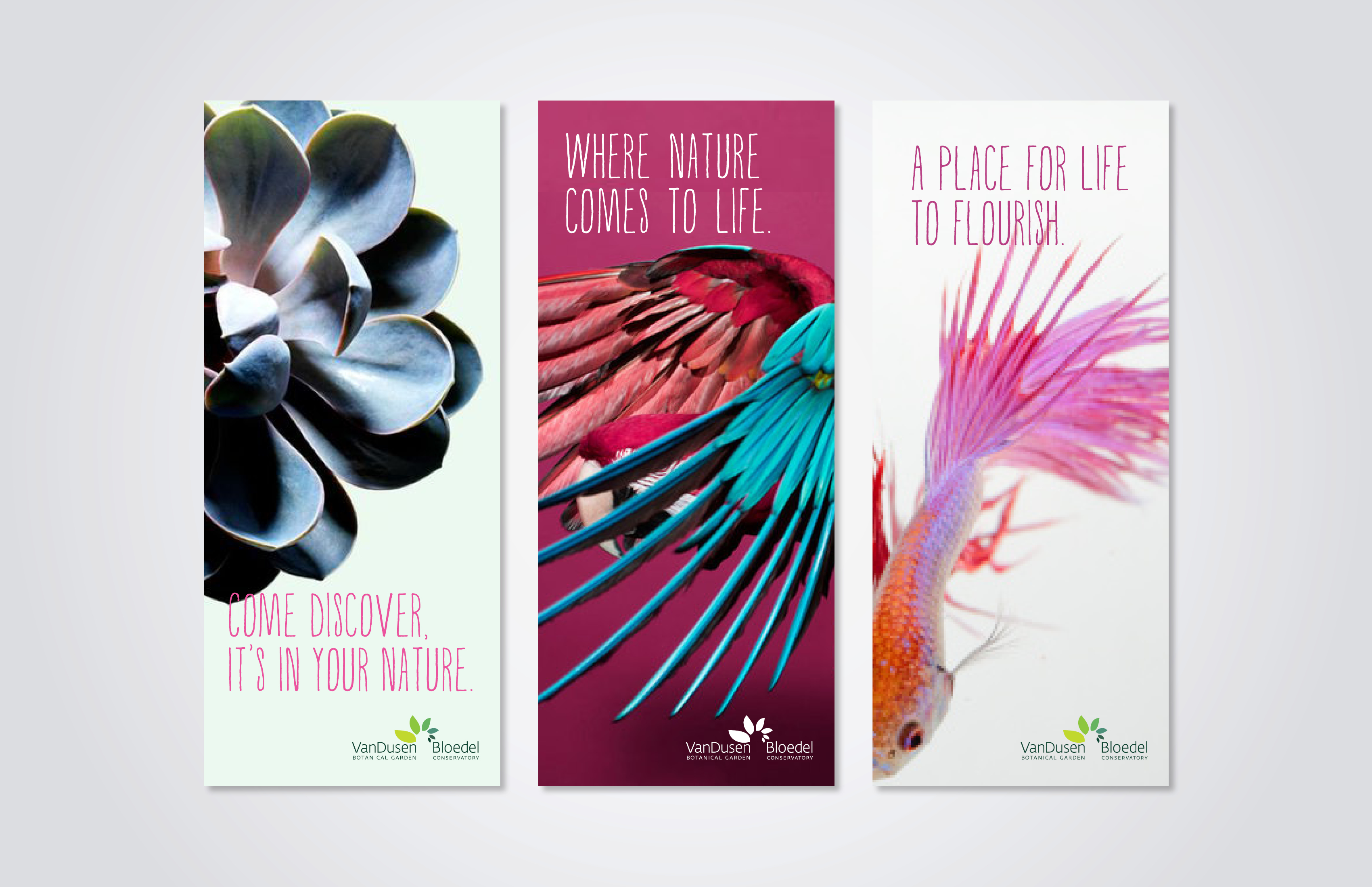


VanDusen Botanical Gardens was looking to broaden its appeal and reposition itself as a premier attraction within Vancouver for locals and tourists alike. A new branding strategy revealed Vandusen exists for life to flourish, the interconnection of people and nature, by bringing plants closer to people they are humanizing nature.
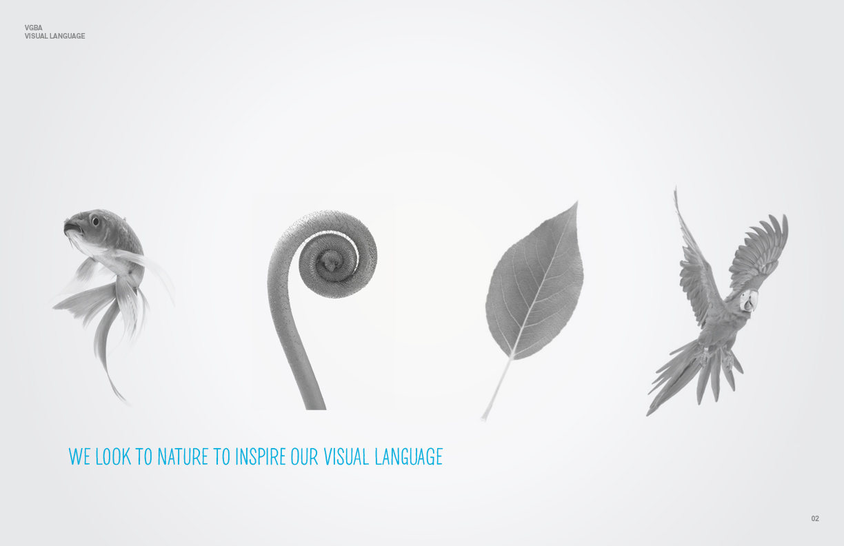
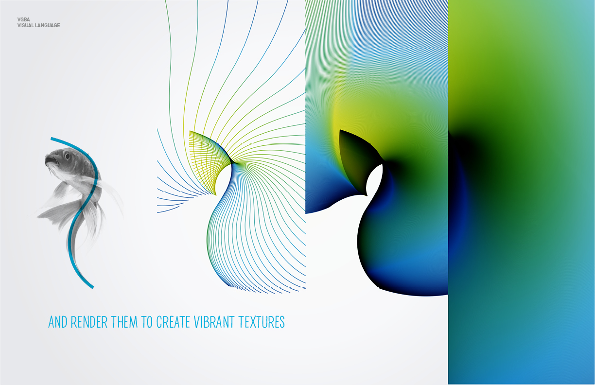
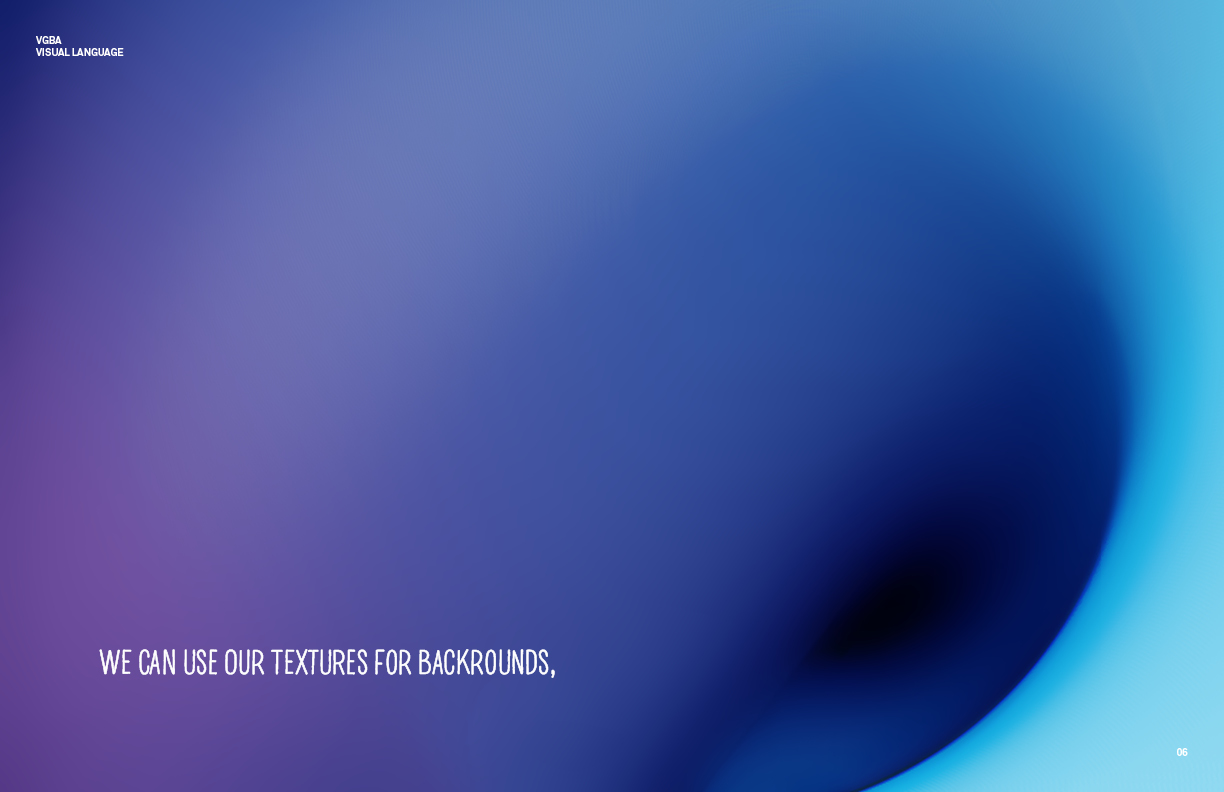
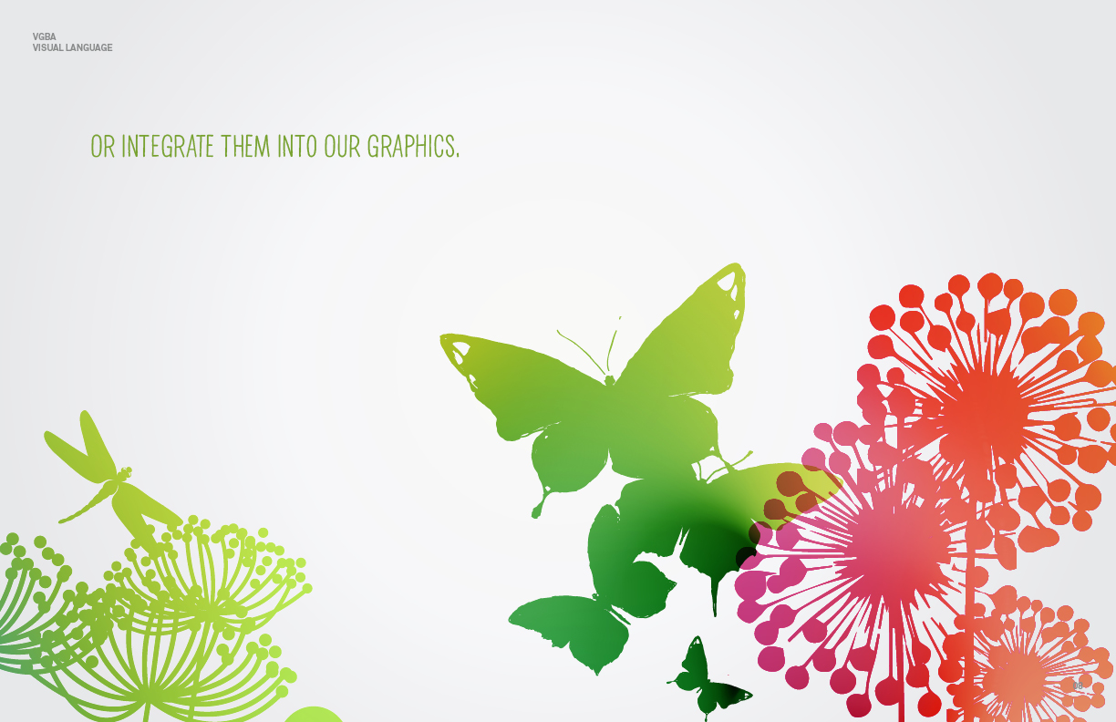
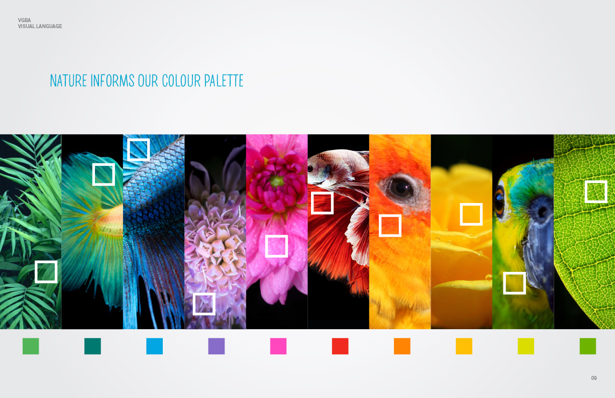
The rebrand fully brought to life the new brand essence of “Human Nature.” Organic textures created from forms in nature were developed as a flexible graphic device to be used as backgrounds or bring vibrancy to a suite of custom graphics. A new colour palette was inspired by the colours from VanDusen’s natural surroundings, while a custom typeface was designed using objects found in nature.
Agency: Cossette
Creative Director: Nick Richards
Design: David Lidiard, Scott Huston
VanDusen Botanical Gardens was looking to broaden its appeal and reposition itself as a premier attraction within Vancouver for locals and tourists alike. A new branding strategy revealed Vandusen exists for life to flourish, the interconnection of people and nature, by bringing plants closer to people they are humanizing nature.
The rebrand fully brought to life the new brand essence of “Human Nature.” Organic textures created from forms in nature were developed as a flexible graphic device to be used as backgrounds or bring vibrancy to a suite of custom graphics. A new colour palette was inspired by the colours from VanDusen’s natural surroundings, while a custom typeface was designed using objects found in nature.
The rebrand fully brought to life the new brand essence of “Human Nature.” Organic textures created from forms in nature were developed as a flexible graphic device to be used as backgrounds or bring vibrancy to a suite of custom graphics. A new colour palette was inspired by the colours from VanDusen’s natural surroundings, while a custom typeface was designed using objects found in nature.